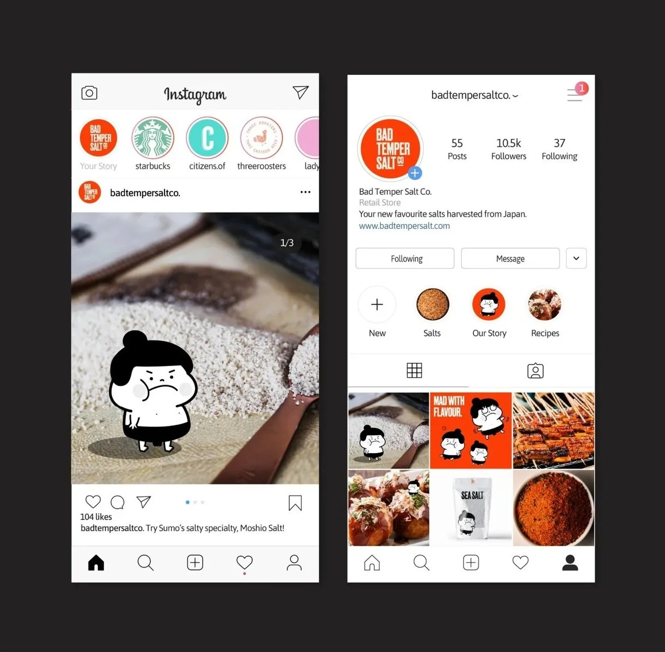
Bad Temper Salt. Co
Role
Graphic Designer
Scope
Event branding, print, signage, digital assets
Deliverables
Logo lockup, menu, invite, printed event graphics, collateral
Bad Temper Salt Co. is a conceptual premium salt brand inspired by Japanese traditions, where salt is regarded as both a purifier and an essential part of daily life.
The identity draws from rituals such as pre-sumo purification, translating cultural symbolism into a bold, character-driven visual system. Designed to scale across packaging, product lines, and brand applications, the system balances playfulness with a refined, contemporary aesthetic.
visual identity
The Bad Temper Salt Co. logo draws inspiration from the Japanese hanko, a traditional name seal used for official signatures and documentation.
DRUK


UNTITLED SANS
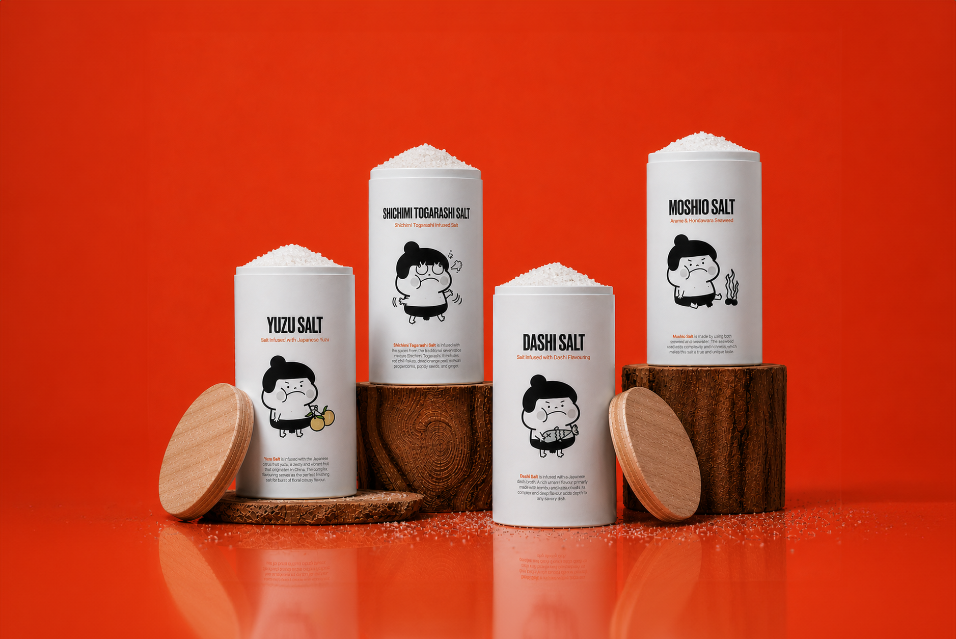
Meet Sumo.
Sumo is the brand’s central character, inspired by the ritual of salt purification performed before sumo matches.
At the start of each bout, wrestlers throw salt into the ring as a symbolic act of cleansing and preparation. This moment informed Sumo’s bold, expressive, and slightly temperamental personality—reflecting both the ritual and the brand’s tone.
Designed to adapt across packaging and brand applications, Sumo adds a distinct sense of character and recognizability to the overall visual system.
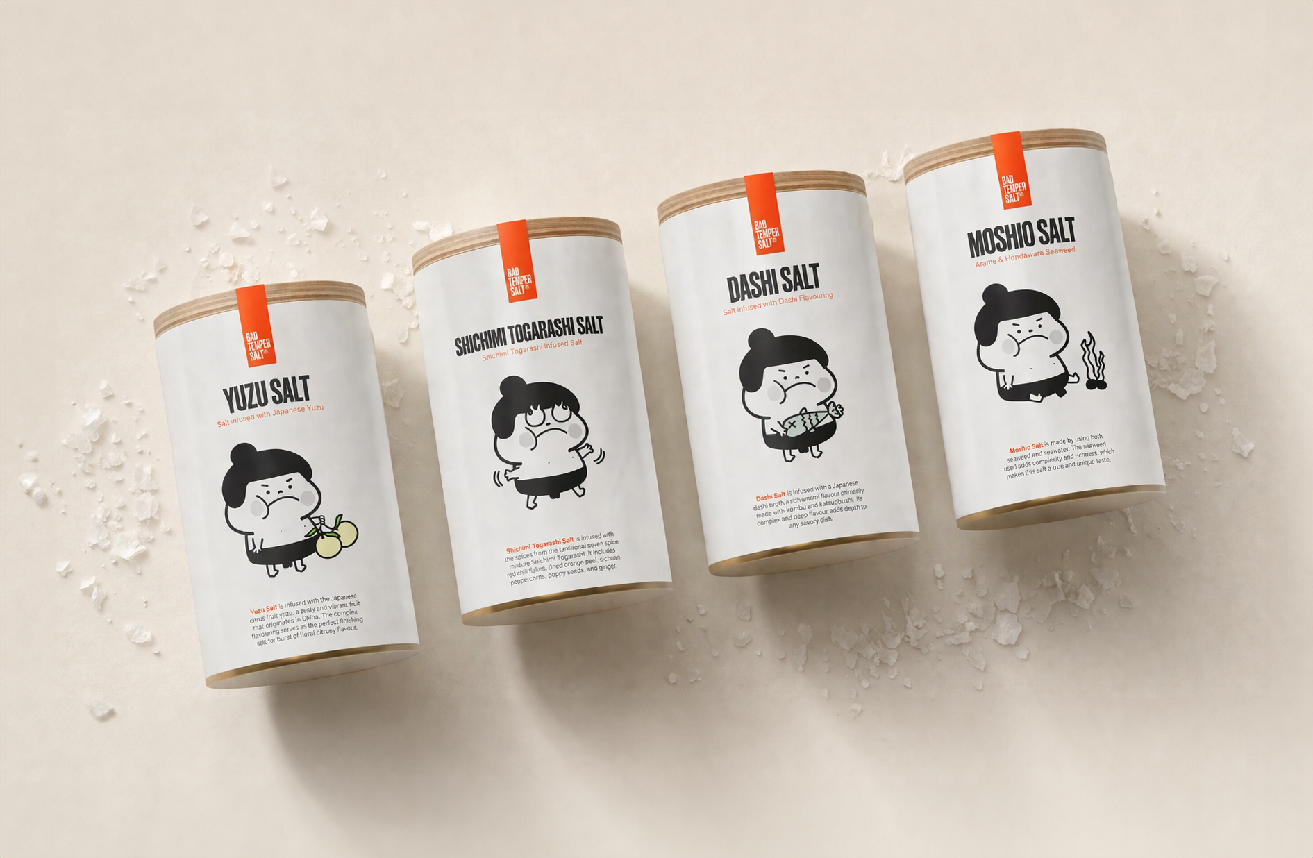
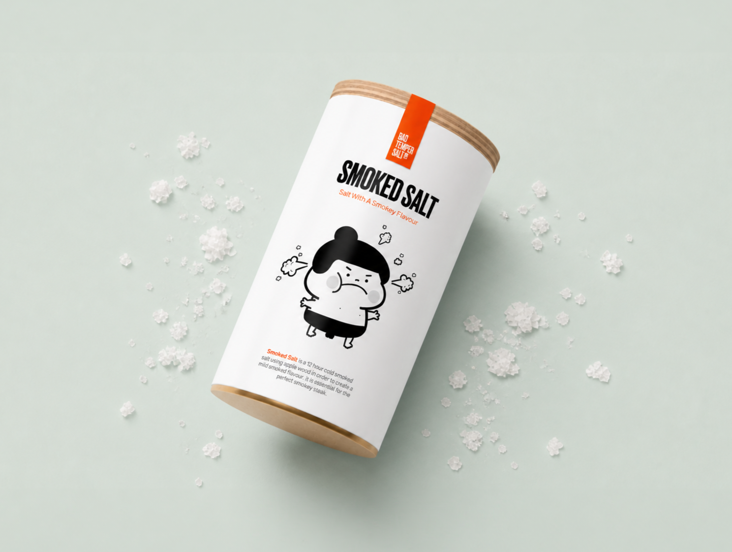
Product packaging system developed to maintain a cohesive visual identity across multiple flavors, combining bold typography with a character-driven approach.

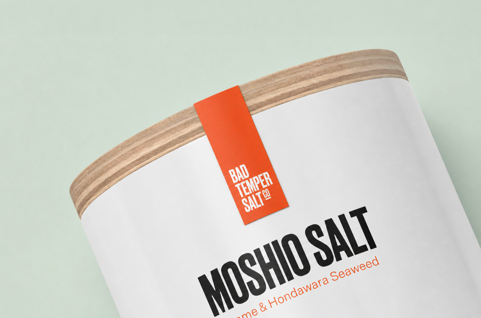
Detail views showcasing typographic hierarchy, material contrast, and simplified brand elements, ensuring clarity and consistency across the packaging system.


Bad Temper Salt Co. also sells accessories such as the salt cellar, the salt cellar wooden spoon, and salt and pepper shakers.